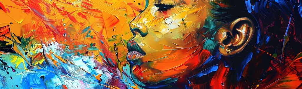
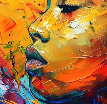
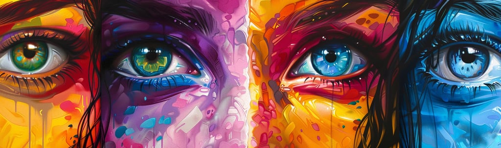
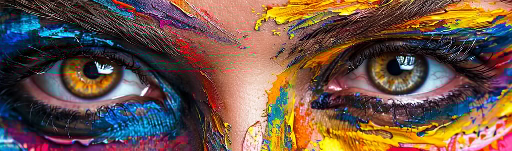
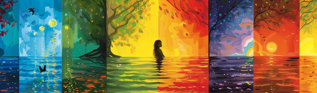
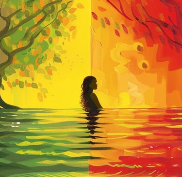
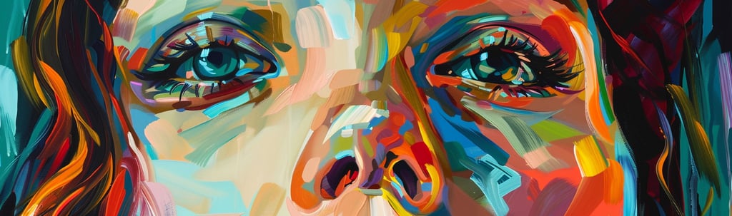
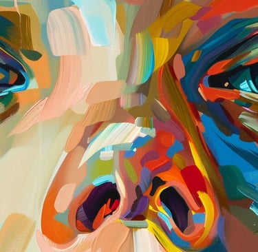
The Color of Emotion: Blending Art and Feelings
Exploring the Palette of Emotions: How Art Captures and Influences Our Feelings
CREATIVITYART
Kat Sanders
5/1/202420 min read
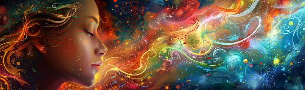
Have you ever wondered how a splash of yellow can brighten your day or why a deep blue can soothe your soul? In "The Color of Emotion: Blending Art and Feelings," we'll explore the magical interplay between color and emotions through the lens of art. We'll see how artists harness the power of color to express and evoke feelings, and how this understanding can deepen our appreciation of art and influence our everyday lives. Get ready to see the world in a more colorful light!
The Power of Color in Art: Discover how colors influence viewer emotions and artist expression.
Understanding The Color Wheel: A breakdown of how artists use this tool to enhance emotional impact.
Color Meanings and Associations: Explore what different colors signify and how they connect to our feelings.
Artistic Techniques for Emotional Depth: Insights into the methods artists use to embed emotion in their work.
Color in Abstract vs. Realistic Art: Comparing how color functions in different artistic styles.
The Role of Cultural and Personal Context: How background and personal experiences influence our interpretation of color.
Color and Art Therapy: An examination of how color therapy can aid emotional healing.
Creating Your Emotional Palette: Tips for using colors to express your own emotions in art.
Engaging with Emotional Art: How to more deeply connect with art through its use of color.
Beyond the Canvas: Color and Emotion in Daily Life: Examples of color influencing mood and atmosphere in everyday settings.
The Universal Language of Color: Understanding how color creates a shared emotional language across different cultures.
The Power of Color in Art
Ever noticed how certain colors make you feel a certain way? Maybe a calm blue sky or a vibrant red dress? Well, you're not alone. Artists have been playing with color to stir emotions for centuries. Let’s dive into how colors not only beautify art but also communicate deep emotional messages.
Introduction to Color Psychology
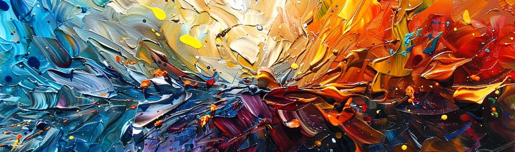
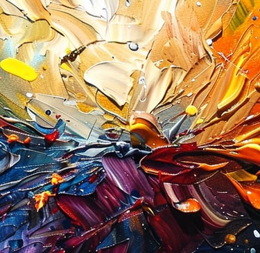
Color psychology is a fascinating field that looks at how different hues impact our mood and behavior. In art, colors are not just fillers; they are powerful tools that artists wield to connect with their audience on an emotional level. For example, warm colors like red, orange, and yellow can evoke feelings of warmth and comfort, but also anger and urgency. On the other hand, cool colors like blue, green, and purple often bring about calmness and sadness. By understanding these effects, artists can create pieces that truly resonate with viewers.
Historical Perspectives on Color and Emotion in Art
Looking back, the use of color in art has always had an emotional component. Think of the lush greens in Renaissance landscapes or the stark contrasts in Gothic stained glass. Each era used color in ways that reflected contemporary understandings of emotion and aesthetics. In the Renaissance, artists began to employ color more deliberately to evoke specific emotional responses from the viewer, a practice that has evolved but continued into modern artistic expressions.
How Artists Harness Color to Convey Feeling
Modern artists continue to explore the emotional power of color, using it to convey complex feelings and stories. Take Mark Rothko’s large, luminous fields of color, which are not just visually striking but also evoke deep emotional responses. Rothko once said his art was about expressing “basic human emotions—tragedy, ecstasy, doom, and so on.” By carefully choosing and applying color, artists manipulate our feelings, guiding us through a visual and emotional journey. They might use a sudden splash of red to jolt us or layers of soothing blues to calm us.
Understanding the power of colors can also enhance our experience as viewers. Knowing why an artist might use certain colors can deepen our appreciation of the work and increase our emotional engagement with it. Whether it’s a chaotic, vibrant Van Gogh or a subdued, contemplative Whistler, color speaks. And when we understand its language, art becomes a much richer conversation.
As we move from canvas to canvas in museums or galleries, or even as we scroll through digital collections, paying attention to how color shapes our feelings can transform a mere viewing into a profound emotional experience. Isn’t it amazing how a simple hue change can tell a whole new story or even alter our mood?
This exploration of color’s emotional power is just the beginning. There’s so much more color does in art, from historical uses to its therapeutic potential.
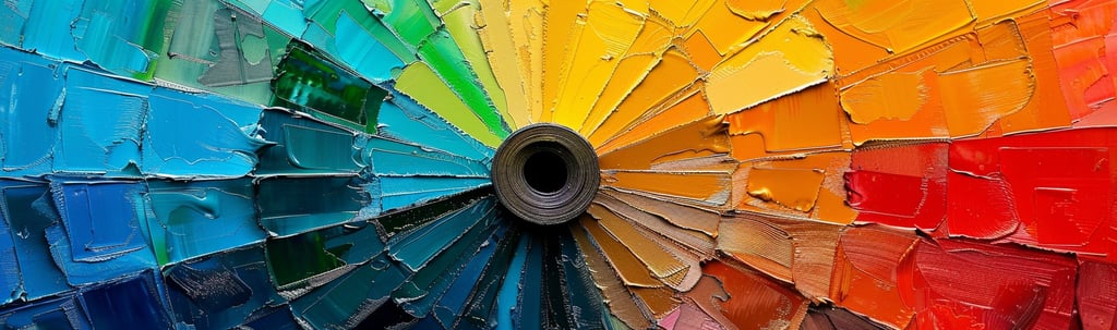
Understanding the Color Wheel
The color wheel isn't just a pretty rainbow of hues—it's a crucial tool for artists, designers, and even psychologists. This simple circle helps us understand relationships between colors and the emotional undertones they carry. Whether you're painting a masterpiece or choosing a color for your room, the color wheel holds the secrets to effective color use.
Quick Overview of the Color Wheel
The basic color wheel consists of twelve colors, starting with the three primary colors: red, yellow, and blue. These are spaced evenly around the wheel. Between them, we find the secondary colors (green, orange, and violet), which are created by mixing two primaries. Then there are the six tertiary colors, made by mixing primary and secondary hues. The wheel shows us how these colors relate to each other, guiding us in creating harmonious designs and artworks.
Warm vs. Cool Colors: Their Emotional Undertones
Colors are often categorized into warm and cool tones, each evoking different feelings and reactions. Warm colors, like red, orange, and yellow, are vivid and energetic. They can stimulate feelings of happiness and warmth but can also trigger anger and discomfort. Cool colors, such as blue, green, and purple, tend to have a calming effect. They can soothe and relax but sometimes bring about sadness or indifference. Artists use these emotional undertones to create a specific atmosphere in their work, directly influencing how we feel about an artwork.
Mixing Colors: The Impact on Mood and Atmosphere
When artists mix colors, they're not just blending paints; they're weaving emotions. For instance, a muted green made by mixing a vibrant yellow and a cool blue might evoke feelings of serenity and growth, suitable for scenes of tranquility or renewal. On the other hand, an intense purple created from a deep blue and a bright red can lend a sense of mystery and depth to a piece. By understanding and manipulating these nuances, artists can more precisely guide the viewer's emotional journey through their art.
The power of the color wheel goes beyond artistic expression; it's a fundamental element in how we perceive and interact with the world. By mastering this tool, artists create not just visual but emotional landscapes that resonate on a deep, often subconscious level.
Color Meanings and Associations
Colors do more than catch our eyes; they capture our feelings and can even influence our behavior. Each color carries its own set of meanings and associations that artists, designers, and marketers use to communicate with us on a psychological level. Let's unwrap the emotional layers of some key colors and see how they affect our mood and perception.
Red's Intensity and Its Varying Emotions
Red is the color of passion, power, and urgency. It’s bold and commands our attention, whether it’s a stop sign or a red carpet. On one hand, red can represent love and warmth, drawing us in with its vibrancy. On the other, it can signal danger or aggression, making our hearts beat a little faster. Artists use red to create a focal point in their artworks, harnessing its energy to evoke strong feelings and draw strong reactions.
The Calm and Serenity of Blue
Blue is the global favorite, often associated with calmness, serenity, and stability. Think of the tranquility of a clear sky or the steadfastness of the deep sea. Blue can lower our stress levels, making it a popular choice for bedrooms and hospitals. However, it can also be seen as cold or melancholic. Artists use blue’s soothing qualities to create a peaceful atmosphere in their works or to convey solitude and sadness.
Yellow's Brightness and Its Effect on Happiness
Yellow, the color of sunlight, is inherently cheerful and stimulating. It’s often used to evoke feelings of happiness and liveliness. However, in overly bright tones, yellow can be overwhelming and even cause unease. In art, yellow can brighten a scene, draw the eye with its luminosity, or inject a burst of energy, depending on its hue and saturation.
Exploring the Depths of Green, Purple, and Beyond
Green is the color of nature, symbolizing growth, harmony, and renewal. It’s soothing yet refreshing, often used in spaces that aim to create a balance. Purple, a mix of calm blue and fiery red, carries connotations of luxury, mystery, and spirituality. Its rarity in nature makes it all the more mystical and intriguing in art.
Beyond these, each color has its spectrum of shades and tints, each evoking different feelings and reactions. Artists blend and contrast these colors to guide viewers’ emotions, creating complex emotional landscapes on their canvases.
Colors are powerful. They do more than just fill space. They tell stories, evoke emotions, and even affect decisions. Understanding the meanings and associations of colors not only enhances our appreciation of art but also gives us insight into the psychological tools at an artist’s disposal.
Artistic Techniques for Emotional Depth
Art isn't just about what you see; it's about what you feel. Artists use a variety of techniques to infuse their work with emotional depth, turning a flat canvas into a dynamic emotional landscape. From playing with color contrast to manipulating texture, each method adds a new layer of meaning and feeling. Let's explore how artists use these techniques to deepen the emotional impact of their art.
Color Contrast: Juxtaposing Feelings
Contrast is a key element in art, particularly with color. By placing opposing colors next to each other, artists can intensify the emotional response of the viewer. For instance, a bright yellow against a dark violet can create a vibrant, energetic effect, while a deep blue next to a pale pink might evoke a sense of calm tension. This juxtaposition can highlight conflicts, emphasize a particular mood, or even guide the viewer’s eye through the artwork, creating a narrative journey of feeling.
Saturation and Value: Adjusting Emotional Intensity
Saturation refers to the purity of a color, while value speaks to its lightness or darkness. Adjusting these elements can dramatically change the emotional tone of a piece. High saturation can make colors appear more vivid and lively, which can enhance feelings of happiness or aggression. Lower saturation can mute emotions, lending a sense of nostalgia or melancholy to the scene. Similarly, darker values can add a sense of mystery or sadness, whereas lighter values might promote feelings of peace and serenity.
Texture and Brushwork: Adding Emotional Layers
Texture and brushwork are where the physical touch of the artist becomes visible, adding a literal and metaphorical depth to the artwork. Rough, aggressive brushstrokes can convey turmoil and passion, while smooth, delicate strokes might suggest tranquility or tenderness. The texture not only affects the look but also the feel of the painting, engaging viewers’ sense of touch and sight to produce a more complex emotional experience.
These techniques are not just tools for expression; they are ways for artists to connect with the audience on a deeper level, pulling them into the emotional world of the artwork. By understanding and observing these techniques, viewers can appreciate not just the visual beauty of art but also the emotional craftsmanship behind it.
Color in Abstract vs. Realistic Art
Color plays a pivotal role in both abstract and realistic art, but the way it's utilized can differ dramatically between the two styles. Each approach offers unique ways to evoke emotions and convey messages through color. Let’s explore how artists in both realms use color to connect with their audiences on an emotional level.
How Abstract Art Uses Color to Evoke Pure Emotion
In abstract art, color isn't just a tool for representation; it's the main subject. Abstract artists use color to express emotions directly, without the constraints of depicting real-world objects. This freedom allows them to create a visceral experience that can be intensely personal and open to interpretation. For instance, an abstract painting might use a chaotic mix of vibrant reds and oranges to evoke energy and unrest, or a serene composition of soft blues and greens to calm and soothe the viewer. The colors in abstract art are often used to stimulate an emotional response that might not be tied to a recognizable scene but is universally felt.
The Role of Color in Enhancing Realism and Relatability
In realistic art, color helps to enhance the lifelikeness and relatability of the scenes depicted. Artists carefully select colors that reflect the natural world to strengthen the believability of their paintings. Color in realistic art often carries symbolic meanings or cultural associations, which can evoke a shared emotional response or convey a particular atmosphere. For example, the use of golden hues in a landscape painting can evoke a sense of nostalgia or the magical hour of twilight, making the scene feel more poignant and emotionally charged.
Case Studies: Comparing Emotional Effects in Different Art Styles
Let's look at how different artists manipulate color in their abstract and realistic works. Mark Rothko’s abstract expressionist pieces, for instance, often feature large, floating blocks of color that create an enveloping, moody atmosphere, prompting deep emotional reflection. In contrast, a realist like Edward Hopper uses color more subtly to enhance the emotional isolation and quiet tension in everyday scenes, such as the lonely blues and stark whites in "Nighthawks."
Through these comparisons, it's evident that whether abstract or realistic, the use of color is fundamental in shaping the emotional impact of art. Each style uses color to communicate feelings and stories in ways that resonate with their audience, drawing them into deeper engagement with the work.
The Role of Cultural and Personal Context
The way we perceive and feel about colors isn't just a universal fact—it's deeply influenced by our cultural backgrounds and personal experiences. This rich tapestry of context adds layers to our understanding and emotional responses to color in art. Let’s explore how these factors shape our interactions with art and deepen its impact.
How Cultural Differences Influence Color Perception and Emotion
Culture plays a significant role in how we interpret colors. Different societies have various meanings attached to colors, which can alter the emotional tone of an artwork depending on its audience. For example, while white is often associated with purity and weddings in many Western cultures, it is traditionally worn at funerals and represents mourning in many Eastern cultures. Artists aware of these cultural nuances can tailor their use of color to communicate more effectively with their audience, or challenge these norms to provoke thought and discussion.
The Subjective Experience of Color: Personal Associations
Colors carry personal significance that varies from one individual to another, influenced by personal memories, experiences, and feelings. These personal associations mean that the same piece of art can evoke different emotions in different viewers. For example, a painting dominated by greens might remind one person of nature and evoke a sense of peace, while another might associate it with illness or negative experiences. This subjectivity makes art a personal journey and allows for a unique connection between the viewer and the artwork.
Sharing Stories: When Viewers See Their Emotions in Art
Art becomes particularly powerful when viewers see their own emotions and experiences reflected in it. This connection is often facilitated by the artist's use of color, which can act as a universal language of emotion. For instance, an artist might use dark, muted colors to convey a sense of loss and mourning, resonating with viewers who have experienced similar emotions. When viewers recognize these emotions, they feel a personal connection to the artwork, which can be incredibly moving and therapeutic.
Understanding the role of cultural and personal context in interpreting color helps us appreciate the deeper meanings behind an artist's choices and enhances our engagement with their work. It reveals that art is not just a matter of aesthetics but a complex interaction of perceptions and emotions.
Color and Art Therapy
Art therapy is a powerful tool that uses the creative process to help improve the mental health and emotional well-being of individuals. Color plays a central role in this therapeutic approach, providing a means for expression and a pathway to healing. Let’s explore how color is used in art therapy to help people express, explore, and understand their emotions.
The Therapeutic Use of Color to Express and Process Emotions
In art therapy, colors are used not just for their aesthetic appeal but for their ability to help individuals communicate feelings that might be too difficult to express with words. Therapists often encourage clients to use colors that they feel connected to or that represent their emotions, which can lead to insightful revelations and personal discoveries. For instance, someone might choose dark colors to represent their sadness or anxiety, providing a starting point for discussing these feelings and working through them.
Guided Art Therapy Activities for Exploring Feelings Through Color
Art therapists use structured activities that involve colors to help clients explore their emotional states. One common activity is the "color your feelings" exercise, where individuals are asked to associate each of their emotions with a color and then create an abstract painting or collage using these colors. This not only helps in expressing feelings in a safe and controlled environment but also aids individuals in understanding how colors can influence their mood and perceptions.
The Healing Power of Creating and Viewing Art
Creating art can be a meditative and healing experience. The act of focusing on colors and designs can be incredibly therapeutic, helping individuals to relax and release stress. Moreover, viewing art also has benefits; colors in artworks can stimulate emotional responses that promote healing and provide comfort. For instance, calm blues and greens are often used in hospitals to create a soothing environment that encourages patient recovery. Similarly, vibrant colors might be used in spaces to energize and uplift the spirits of those within.
Through these therapeutic practices, color becomes more than a visual element—it becomes a tool for healing. The use of art therapy shows just how profound our connection to color is, and how it can be harnessed to improve our mental and emotional health.
Creating Your Emotional Palette
As we delve deeper into the emotional potential of color in art, it's clear that artists can greatly benefit from consciously curating their color choices to enhance emotional expression. Creating a personal "emotional palette" can be a transformative tool for artists aiming to connect more deeply with their audience and themselves. Let’s explore some tips and techniques for artists to express emotion through color more effectively.
Tips for Artists Wanting to Explore Emotion Through Color
For artists looking to harness the emotional power of color, the first step is to become familiar with the basic principles of color theory. Understanding how different colors and their combinations affect mood and emotion is crucial. From there, artists should experiment with these colors in various contexts, noting the feelings they evoke during the creative process and in viewers. It’s also beneficial for artists to keep an emotional journal, documenting how certain colors influence their personal feelings and the feedback they receive from others.
Choosing Colors that Resonate with Personal Experiences
When developing an emotional palette, artists should consider their own emotional responses to colors, which are often shaped by personal experiences and cultural background. Reflecting on how certain hues relate to personal memories or feelings can guide artists in selecting colors that genuinely represent their emotional landscapes. This personal connection not only makes the artwork more authentic but also enhances the emotional resonance for viewers who may share similar experiences or feelings.
Techniques for Experimenting with Emotional Expression
Artists can experiment with various techniques to see how color manipulations affect emotional expression. For instance, using contrasting colors can amplify emotional intensity, while analogous colors might create a more harmonious and subtle emotional expression. Artists can also explore different mediums and textures, which interact with color to enhance or transform the emotional effect. For example, a rough, textured surface might make a dark hue appear even more somber, while a smooth, glossy surface could make the same color appear more serene.
By intentionally curating their use of color, artists not only deepen their own emotional expression but also create art that speaks more powerly to the emotions of others. This process of exploration and experimentation with color is not just about creating art; it's about communicating and connecting on a deeply human level.
Engaging with Emotional Art
Art is not just something to be seen; it's something to be felt. As we wrap up our exploration of color and emotion in art, it's crucial to understand how we can engage more deeply with artworks, viewing them through an emotional lens. Here are some ways to enhance your art appreciation and develop your emotional literacy through the vibrant language of color.
How to View Art Through an Emotional Lens
Viewing art emotionally means looking beyond the surface to understand the feelings it conveys. Begin by spending more time with each piece, allowing yourself to truly absorb the colors and their impact. Ask yourself how the colors make you feel and why an artist might have chosen those particular hues. Reflect on the emotions that each color brings up for you and consider the overall mood of the artwork. This practice not only deepens your appreciation of art but also enhances your understanding of your own emotional responses.
Activities for Art Appreciation that Focus on Feelings and Color
Engaging in activities that focus on the emotional aspects of art can be both enlightening and enjoyable. Organize or participate in art viewing sessions that encourage discussing each other's emotional reactions to artworks. Another activity could be an art swap where participants create small, color-focused pieces that express specific emotions, then share and discuss their works with the group. These activities can foster a deeper connection with art and with other viewers, creating a shared experience of emotional exploration.
Encouraging Emotional Literacy Through Art
Art can be a powerful tool for developing emotional literacy, helping individuals recognize and articulate their feelings. Schools, community centers, and even workplaces can incorporate art appreciation into their programs, using color and its emotional resonances as a gateway to discussing and understanding emotions. Workshops or interactive galleries that focus on emotional responses to art can provide valuable insights into personal and collective emotional experiences, promoting a more nuanced understanding of both art and emotional health.
By actively engaging with emotional art, we not only enrich our aesthetic experience but also develop a greater capacity to express and understand our feelings. This journey through art becomes a journey within ourselves, revealing the deep connections between color, emotion, and human experience.
Beyond the Canvas: Color and Emotion in Daily Life
While art provides a vivid exploration of how color influences emotions, the impact of color extends far beyond the gallery walls into our daily lives. Colors shape our mood and behavior in subtle and significant ways every day. Understanding this can help us make more mindful choices in our environments and enhance our overall well-being.
The Influence of Color on Mood and Behavior in Everyday Settings
Every day, we're surrounded by colors that affect us in ways we might not consciously realize. For example, fast food restaurants often use reds and yellows because these colors can stimulate appetite and create a sense of urgency. Alternatively, hospitals frequently utilize soft blues and greens to promote a calming atmosphere that can help reduce stress. By becoming more aware of how color impacts our mood and behavior, we can better understand our reactions and feelings in different environments.
Choosing Colors for Personal Spaces to Enhance Well-Being
The colors we choose for our personal spaces, like our homes and offices, play a crucial role in our daily emotional health. Choosing the right colors for these environments can significantly affect our mood and productivity. Soft blues and greens are often recommended for bedrooms and bathrooms for their calming effect, while vibrant colors like yellow or orange can be great choices for kitchens and dining areas where energy and communication are key. Experimenting with different colors can help you find the best palette to support your happiness and well-being in every room.
The Future of Designing with Color and Emotion in Mind
As we become more attuned to the psychological effects of color, designers and architects are increasingly considering emotional impact in their work. This can be seen in everything from the color of school walls to enhance learning and concentration, to the use of specific color schemes in workplaces to boost creativity and reduce fatigue. The future of design promises even greater personalization and innovation, using color psychology to create spaces that not only look good but also feel good.
Color is a powerful tool that, when used wisely, can enrich and improve our daily lives. By understanding and applying the emotional aspects of color, we can create environments that enhance our well-being and make our everyday experiences more joyful and vibrant.
The Universal Language of Color
Color communicates in a language that transcends words and crosses cultural barriers. It creates an unspoken dialogue between artist and viewer, conveying emotions and messages that resonate on a deeply human level. This universal language of color has the power to connect us across time and space, proving both timeless and profoundly impactful.
Reflecting on the Unspoken Emotional Dialogue Between Artist and Viewer
The interaction between artist and viewer through color is a silent yet powerful exchange. Artists choose colors not just for their aesthetic value but for their ability to convey feelings and evoke responses. This selection process is thoughtful and intentional, aimed at communicating specific emotions. As viewers, when we engage with art, we respond to these color cues, often subconsciously. This emotional dialogue, though unspoken, is incredibly effective in connecting us to the artist's internal world and the broader human condition.
The Timeless Nature of Color and Emotion in Art
The emotional impact of color in art is not bound by era or geography. From the cave paintings of Lascaux to modern digital art, colors have always played a crucial role in artistic expression. The fundamental human reactions to colors haven't changed much over the millennia; they tap into something primal within us all. This timeless aspect ensures that art from any period can speak to us today, demonstrating the enduring power of color to convey emotion and meaning.
Encouraging Readers to Explore Their Emotional Responses to Color in Art
As you engage with art in your daily life or during visits to galleries and museums, take a moment to notice your emotional responses to the colors used in different artworks. What feelings do the colors evoke in you? Do certain colors always seem to stir specific emotions? Reflecting on these questions can deepen your understanding of your emotional landscape as well as enhance your appreciation of art. Try creating your own artworks focusing on the use of color to express feelings, or participate in community art projects to see how others use color to communicate their emotions. This exploration can be both enlightening and incredibly rewarding.
The language of color is rich and emotive, offering each of us a way to communicate our feelings and experiences without words. As we conclude this journey through the emotional power of color in art, we encourage you to continue exploring and responding to the colors around you, enriching your emotional and aesthetic experiences.
As we've journeyed through the vibrant world of color and its profound impact on emotions in art, it’s clear that color is not just something to see; it’s something to experience and explore. Now, it’s your turn to dive deeper and share the colorful journey with others. Here are some ways you can actively engage with the emotional power of color in art:
Share Your Experiences with Color and Emotion in Art
We invite you to share your personal stories and experiences with color in art. How has a specific color influenced your mood or evoked a particular memory? Do you find certain colors consistently impactful? Share your stories on social media, in blogs, or with friends and family. By sharing, you contribute to a broader conversation about the emotional power of color, enriching our collective understanding and appreciation of this fascinating subject.
Visit Galleries or Museums to See Examples Firsthand
One of the best ways to truly appreciate the impact of color in art is to see it in person. Visit local galleries and museums where you can experience artworks firsthand. Observe how different artists use color to convey emotion and message. Take your time with each piece, noticing how the colors affect your feelings and thoughts. Each visit can offer new insights and inspirations, deepening your connection to art.
Encourage Experimenting with Color in Personal Art Projects
Finally, why not bring the power of color into your own creative projects? Whether you’re a seasoned artist or a beginner, experimenting with color is a wonderful way to explore your emotional depths and express yourself. Try new combinations, play with contrasts, and see how different colors interact. Use art to reflect on your emotions, or simply let the colors guide your creative impulses. The process of creating can be as rewarding as the finished product.
As you embark on these activities, remember that every color has a story and every hue holds an emotion. By engaging with the emotional language of color, you not only enhance your artistic and aesthetic sensibilities but also deepen your emotional awareness. So, go ahead—explore, create, and share the incredible journey of color and emotion in art.